robcursons.com
Seeing an exciting, new award winning product to market, while supporting a bee conservation charity. Work includes logo, branding, packaging and marketing materials for Anno Orange & Honey gin.
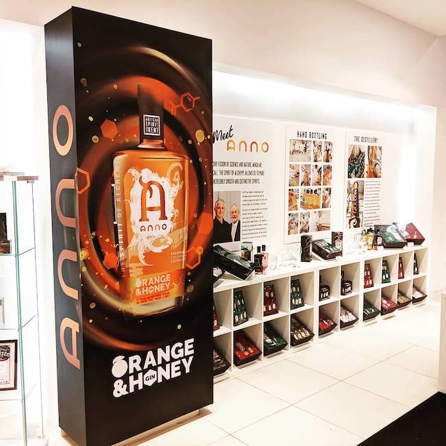
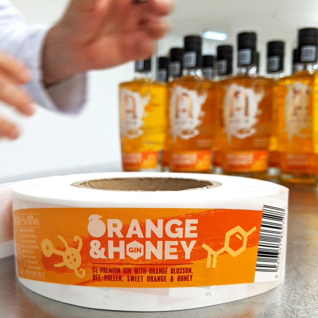
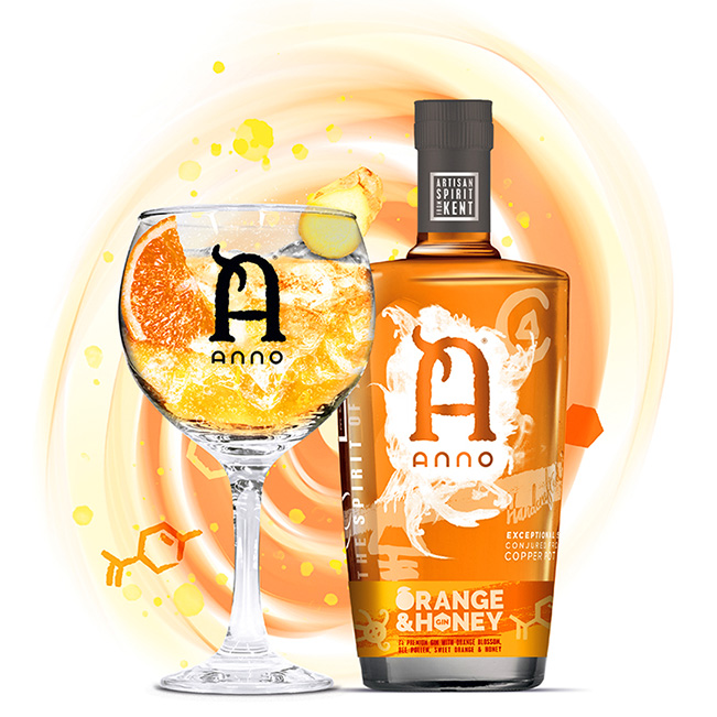
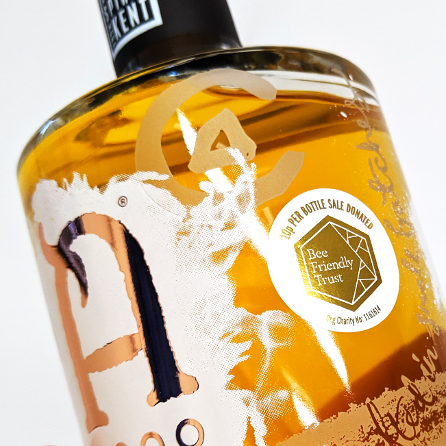
The product concept and research was on bees and nature, as raw local honey, bee pollen and orange blossom are key ingredients. I designed the name, logo, alchemy symbols and all marketing graphics with this in mind. The representation of natural ingredients and flavours is key to the message of Anno Orange & Honey Gin. I built a relationship with Bee Friendly Trust, placing their logo in metallic gold on each bottle. Anno donate 10p per bottle to the charity. The product launched at Anno Distillers Bluewater shopping centre pop-up shop in 2019.
Media:
• Full colour labels on 70cl screen printed and acid etched bottles finished with real copper
• Paper labels with metallic gold foil
• Miniature design screen printed in spot colours and orange and copper metallic foiling on transparent flexible labels
• Printed postcards
• Booklets
• Foamex board shop graphics
Links:
Learn more about Anno Orange & Honey Gin or order here.
Winner in the Kent Life Food & Drink Awards 2019, read more.
The design was recognised among The Best Beverage Packaging Designs by DesignRush in 2024, read more.
You might also like:

Copyright © 2025 Rob Cursons unless otherwise stated.